
Originally published in GDC Journal #7, 2018
The tragedy of the common store front sign.
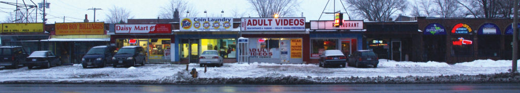
Store front signage is arguably the most visible graphic design in the environment. With the exception of upscale and historic enclaves, the inside of malls, and some of the larger chains, the majority of store signage—for independents and franchisees—is generally a ghastly blight on the Canadian streetscape. Very little of this involves professionally qualified graphic designers.
It would be wrong to castigate the sign companies which do the work, for the problem is systemic. To begin with, the North American civic attitude considers retail zones as a free-for-all where commerce rules, and big, cheap and flashy trumps good taste. In mall after mall, from main street to corner store, it’s understood that it’s okay for the retail environment to be ugly as sin, because pretty is a waste of money.
We turn a blind eye to the many unpleasant consequences of automobile dependency, building subdivisions of double garages with living accommodation at rear. On streets where cars take precedence over cyclists and pedestrians, and in vast mall parking lots which nobody walks for pleasure (given the option, one drives across), low-rise stores are viewed through windshields from afar, their signs restricted by area-of-facade bylaws to thin strips into which text is crammed for “visibility.” Less urban sprawl and taller buildings would help. The big box stores which anchor shopping centres, and chains with their own buildings of sufficient size and distinctive architecture, fare better, but the signage of rank and file merchants is severely compromised before it is even begun.
Pedestrian shopping areas are fine: inside malls, signage does not need to shout at motorists to be noticed, and the same is true of “lifestyle” malls, such as the 2008 redevelopment of the Don Mills Centre, a mid-century modern atrium-style mall, into The Shops at Don Mills, a neighbourhood of shops with spaces where pedestrians may idle, and an emphasis on walkability. However, the overwhelming majority of retail developers rarely provide buildings with the proper architectural features to accommodate a variety of individual signs, and it is crucial that signage be integrated into the design of a multi-unit facade, as a distinct element of architectural substance, for a street to have any chance of aesthetic dignity.
Making signage an architectural feature doesn’t happen when the emphasis is on reducing cost: there’s an economy for the developer in providing a blank wall and leaving signage to the merchant, just as there is an economy in the merchant commissioning design from a sign manufacturer, and in the sign manufacturer offering design as a service performed by employees of limited design education. None of these steps necessarily leads to disaster, but in general they lessen the amount of quality time and material investment that is put into fascia signage. Down the line the image suffers, with the result that store front signage is at the bottom of the heap for graphic designers. While it may be touched upon in design school as part of corporate identity, it is not a staple of the graphic design profession. There is little incentive: it’s not a remuneratively rewarding genre of work, neither is it creatively rewarding, constrained as it is by elements beyond the designer’s control. In a row of stores, individual signs are side-by-side and willy-nilly, a crazy disharmony which taints all, not unlike a stack of small space ads in a magazine, or banner ads on a website. But worse, signs are often randomly sized or butted up against one another, ignominies that would not be visited upon print or web ads. Like pizza flyers, store front signage is absent from awards competitions; wayfinding systems have the cachet.
The sign company or design firm which presents a small-store client with a sign proposal of subtlety and restraint is asking for trouble. The merchant will want it bigger, to snare motorists, and often not just the name, but also a description of products and services offered, with phone number and URL for good measure, cluttering up and defacing the facade.
But there are towns where shopping streets are a pleasure to walk, where one’s eyes are not continually offended by aggressive, garish signs with distorted typography; in Ontario for instance, Niagara-on-the-Lake, Huntsville, and Orangeville. The game changer is heritage zoning.
In 1985 a provincial planning act (the Ontario Heritage Act) allowed for the provision of heritage zones, and certain towns, prompted by a broad variety of stakeholders—residents, historical activists, heritage-attuned BIAs (Business Improvement Areas), merchants, councillors and civic staff—began to place historically sensitive restrictions on signage. Now that municipalities post their bylaws on the Internet, they have become very aware of what each other is doing, which has facilitated this zoning movement.
The most significant aspect of the trend has been the prohibition of back-lit and neon signs. Although this is ostensibly to avoid anachronism in pre-electric developments, the result has been to turn down the volume, as it were, and allow design space for subtle and tactile qualities to emerge, away from the vulgarity of the vinyl cut. This parallels another trend—the adoption of hand-made and hand lettered signs in hip neighbourhoods, a high-touch antidote to the hegemony of high-tech culture, with nostalgic overtones. Another incidental benefit of heritage zoning is a self-regulated harmonization of style, towards the classic, because merchants are very much aware that there is a group identity to the street, which they’ve all bought into, otherwise they wouldn’t be there, they’d be out in a suburban mall.
Perhaps the most distinguished example of historic zoning is postcard-perfect Niagara-on-the-Lake. There, submissions for store signage must not only conform to the bylaw, but also be approved by a heritage committee. Colour guidelines that complement the historic streetscape are posted online, and merchants are encouraged to keep things simple, avoiding excessive “earlying up” such as ye olde blackletter script.
The success of Orangeville’s heritage zoning informs its newest shopping development, Westside Market Village. While its older malls are magnificently bleak and nasty tracts of tarmac and concrete, Westside Market Village channels the historic vibe of Orangeville’s downtown Victorian main street, Broadway, incorporating the traditional two-tone decorative brickwork of 19th century Ontario and the staggered cornice profile of its main street facades. Although the anchor stores have backlit signs, the small-store strips—always the weakest link—feature formalized, standard-sized sign-plates illuminated from above by goose-neck lamps. The signs are not substantially integrated into the architecture (seeming somewhat like add-ons) and the borders are a bit busy and large, but the overall effect is a dignified improvement over the typical random mess.
Westside Market Village, with its sign boards designated as part of site plan approval, points a promising direction for future improvements to main street and mall Canada. The onus is on local councils, developers, builders and architects to set the stage and make things easy for the sign industry to do a good job for clients—because when the prime movers ignore their responsibility to provide a suitable frame and canvas for signage, they allow this final design element the leeway to spoil otherwise commendable projects. Who knows, eventually graphic designers may even become more involved in adding value to this aesthetically impoverished sector of the built environment.
Nick Shinn — GDC Journal #7, 2018
—
Looking to contribute to the national conversation and elevate the Canadian design communications profession? Submit your article to our editorial team: designcurrency@descan.ca