A unique approach to hand hygiene
We’ve all seen them. The black and white hand washing instructional drawings, photocopied for the thousandth time, carefully demonstrating proper technique.
Or the ultra-safe, committee-placating cartoon characters eagerly explaining the dangers of dirty hands. Yup… probably the number one reason I grew up not washing my hands enough.
I suppose that subconsciously then, as consciously now, I assumed that if the creator of a message was serious about changing my behavior in some way, then they would have put some effort into creating something even slightly compelling. As this was not the case, I naturally assumed it wasn’t a big deal. Conversely, I clearly remember a local anti-littering ad campaign from when I was a kid. It was funny, well executed and memorable. Whether it was a contributing factor or not, today I’m one of those obsessive people who stops and picks up other people’s litter on a regular basis.
As a visual communicator, when I was approached by the Saskatoon Health Region to discuss how to improve on public hand washing awareness and compliance, I was naturally eager to take a shot at a campaign that could potentially make a difference. Illness in the workplace and schools actually takes an enormous toll on our economy and society as a whole, and the possibility of reducing it represented an exciting and truly rewarding opportunity.
The great news was that after years of using posters and brochures unchanged since who-knows-when, and with less than ideal results, the client was serious. They understood that we needed an approach that was new, and one that would probably have to stretch their comfort zone as a public agency.
OK, so pencils up…. here we go. The biggest challenge for a campaign of this nature is that it’s not a question of changing someones perspective towards something external, like advocacy, political messaging, or convincing them product A is better than product B. It’s a case of a person being motivated internally to re-evaluate lifelong behaviors and attitudes, with no immediate and obvious gratification, product or tax receipt to show for it.
Just how do you reach that sweet spot in peoples brains? And I don’t mean the superficial spot where that awful jingle gets stuck in your head. I mean the one that changes attitudes, the one that could possibly stop someone at the hand sanitizer station.
So would the solution be to just gross people out, as cigarette packaging tries to do? I supposed that actually seeing the germs one likely has on ones hands obviously reflects a certain amount of the message. This could be PART of the creative, but there had to be more… it would be too preachy and not really interesting, and besides, people might not put up posters like this at all.
Could it be a purely humorous approach? Let’s see. As the ideas began to flow, and some of them pretty cool ones, I found I was rejecting concept after concept. I couldn’t quite put my finger on it (no pun intended), but I just felt that while the ideas might offer the viewer a giggle or turn a head, they probably would fail to achieve more than a superficial impact.
What dawned on me was that most people don’t care about how bacteria reproduce, which types are more dangerous or how much of it is on which part of your body; out of sight, out of mind you could say. But what I know people DO care about is the possibility of spending a weekend with the toilet instead of their golfing buddies.
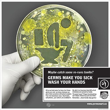
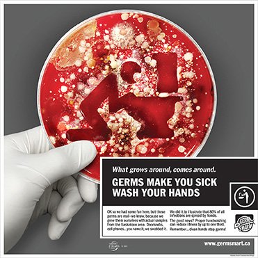
So the Bottom line: germs are indeed gross, and they can make you really sick. As is often the case, the solution was almost a no-brainer, once the problem was thoroughly explored; why not literally ‘illustrate’ what germs can do to you…using REAL germs. And what would be even cooler? Rather than utilize stock lab cultures, let’s drive home the immediacy of the problem by using bacteria sampled from around the viewers own local environment, and highlight this fact in the campaign.
Since this was a new client for me, I really had no idea how they would react to the idea; I figured I had a 50/50 chance. So with toes crossed, I ran them through the concept… and they loved it (I knew they would!).
But as has happened to me several times before after proposing some out-there ideas, reality reared it’s annoying head. There are many times in one’s design career that cool ideas are automatically rejected due to ‘lack of reasonable plausibility’ and the ‘are you completely insane?’ factor. Looking back many months later at this project, I think it’s safe to say this absolutely should have been one of those times. Fortunately, at least for this occasion, these critical filters were disabled during my youth at some point (probably due to one of many bumps on the head).
I hadn’t the foggiest idea where to start. I had envisioned growing these in my garage at any hour of the day or night that suited me. I needed petri dishes…where do we get those, and how much do they cost? They could have been 10c each or $10 for all I knew. What colors can we get them in? What will, or will not, grow in them? Will my girlfriend leave me? Who gets the fancy coffee maker in the split?
I also thought I could just put on a mask and some gloves and go nuts with this stuff… turns out I was wrong and could have destroyed humanity as we know it (OK perhaps not, but I’m told it might not have been the smartest thing to do). Right…so we need a lab. I don’t know anyone with a lab that isn’t the kind that poops on your lawn. (Note to self… get a sample of germs from dogs tongue…and the madness begins).
We arranged a meeting with the pros at a Saskatoon Health Region microbiology lab to see if they would be willing partners in the campaign, and looking back I can honestly say they were absolutely amazing; accommodating right from the start (even if a little perplexed).
So the yet-to-be-created process of illustrating the creative began. The problems I faced were many, but could largely be broken into two categories; logistical (scheduling and lab restrictions) and illustrative (developing techniques, from scratch, to control the germs and achieve a suitable effect).
As this was a working lab, it was pretty full of equipment and staff. After some chin-scratching, they found a small area that I could use for a few weeks – it would do. But the main challenge was time. These people are running a lab in a major hospital; they’re busy. Ideally I would have had access to the lab 24/7, but this just wasn’t an option. They found time for me on the days they could, often at 7 am, on average for anywhere from half an hour to one hour; two to three hours would have been better!
Another hurdle was lab procedure for things coming in and out of the facility. For example, all my camera gear, or anything else I brought in, had to be disinfected every time I left the lab. This clean-up was part of the allotted time, so it all added to the stress for sure. But enough about that..I had images to produce, and the show must grow on!
I knew it would be a challenge for me to step outside of my visual world and get my head around the biology, science and procedures, but I hadn’t anticipated how hard it would be for the lab to get their heads around what I was thinking. It was truly interesting to witness these two worlds collide. As a designer, I went in thinking about microbiology from a design point of view; while the lab staff were thinking about design from a microbiology point of view (not the same thing, it turns out).
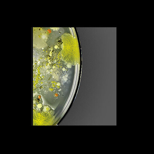
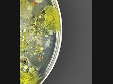
To a microbiologist, a petri dish is usually a series of lines drawn with a contaminated swab…not really too gross looking or particularly visually intriguing. To me however, a really bitchin’ petri dish is a slimy, furry bubbling cesspool of bacterial “what the _ _ _ _ is that!” So…when the lab did some initial tests for me, they did an unbelievable job. They had pinks, greens, whites all neatly and sharply separated into perfect shapes. But one problem: they looked nothing like ‘germs’, and definitely not gross in the slightest.
Don’t get me wrong…these people know what they are doing when it comes to biology. They knew that this certain strain from their stock would grow this color and be smooth (like paint), and that strain would be another color …and so on. In their efforts to visualize ‘germ illustration’, they were essentially doing a paint-by-number, and a darn good one I must say!
In my initial concepts, I had envisioned drawing the images of the distraught figures as positives, ie: the germs forming the image of the person, and the blank petri dish (or ‘agar’ as I learned the medium is called) forming the background. I had some success with this, but after many tries, I realized that the germs often grew too ‘spor’adically, sometimes growing where I wanted, but usually not. Another issue with this approach was timing. As the germs grew just enough for the image to be close to recognizable, I had to take the photo within a small time window, before they overgrew. With my access to the lab being limited, this method would prove basically impossible.
Another thing I realized was that the larger the area the germs had to disseminate, the grosser they tended to look. To take advantage of this, I decided do the image in negative instead, with the germs growing freely to the outer edges of the dish. But my problem creating a recognizable image wasn’t solved. To keep the germs from growing over into the image, I tried dabbing disinfectant onto the negative area, and I also tried cutting masks so I could try spraying the disinfectant. The spraying worked better, but to be an effective visual, the sick people had to be clear.
So after days and weeks of early morning lab sessions, culturing countless dishes, swabbing store shelves, cel phones, the bottoms of peoples shoes (you name it) and many different attempts at a technique that could work… I had it!
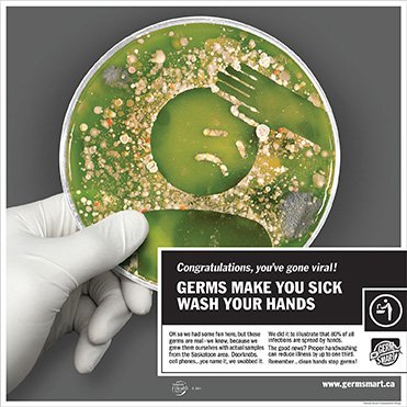
After all the trial and error, the secret was, of course, simple. The method involved placing a clear vinyl sticker of the person on the dish and infecting all around it. The germs generally didn’t grow well under the sticker, so this provided a nice clean edge, while at the same time the germs were allowed to grow uninhibited around the sticker, giving a wild (and disgusting) quality. With the help of a vinyl cutting supplier, we were able to easily try many attempts at a time, thus ensuring a result sooner or later.
Usually designers illustrate in predictable media like pencil or paint, so working with something that could grow in any color, any shape, in any direction, and on it’s own timetable certainly presented it’s own challenges. But there was one more. The lab required much of my work, including the photography, to be done in a negative airflow booth. This booth was about 3’ high, with a 10” bit to get your hands under the glass. I’ll spare you the play-by-play, you’re probably getting the idea! In the end though, something worth keeping is worth fighting for, and any of us should welcome creative adversity if the goal is a unique and interesting outcome.
The campaign was launched at a news conference this fall, and the response has been more than I hoped for, with very strong recognition and uptake in the community and area health care facilities. Congratulations to The Saskatoon Health Region on the launch of their new hand hygiene campaign, I was extremely proud to be a part, and am always grateful to work with clients that allow bold ideas to ‘grow’.
Christian Jensen, CDP
—
Looking to contribute to the national conversation and elevate the Canadian design communications profession? Submit your article to our editorial team: designcurrency@descan.ca