Originally published in GDC Journal #7, 2018
Designers are usually the first to take note whenever a significant corporation changes its identity—for better or for worse. They aren’t shy to voice their opinions or post their comments online. And when a logo that is perceived to be “timeless” becomes redesigned beyond recognition, the industry at large seems to mourn the loss. In this digital world, much to the demise of the design community, designers have discerningly watched companies carelessly overdecorate their Modernist identities with gradients and meaningless Photoshop effects.of the GO Transit Logo
It’s becoming a rarity that a prominent brand would go more than a few years without revisiting or changing their identity. It’s even less likely that a company, who’s been around for multiple decades, would look anything like it did when it was first introduced. But when a brand preserves their original identity for half of a century or more, and still appears modern, some would agree it’s obvious a true masterpiece was created.
GO Transit is one of the few brands to accomplish this. But the designer and creator of the iconic logo is the most under-appreciated Modernist in Canadian design history. Here’s why…
It wasn’t until 2008, more than 40 years since the GO Transit logo was designed, that Frank Fox, creator of the logo, was widely known for his work. Despite the success of the brand and GO Transit itself, Fox has been overshadowed by other, more popular Canadian Modernist designers like Allan Fleming, Burton Kramer, and Jim Donoahue.
A few years ago, while I was studying graphic design in school, I wrote a paper on the history of the GO Transit logo. During my research, I contacted Frank Fox directly, now a retired NSCAD professor, and asked him to recall his memory on the creation of the logo.
In an email, Fox states, “Over the years [Gangon/Valkus] had developed a good working relationship with the advertising agency, McConnell Eastman. They were the ad agency for CN and had the contract to produce an brand for the Ontario government and the new transit system for the city of Toronto. With the support of CN, Gagnon/Valkus was given a contract to develop the [GOTransit logo] under the umbrella of McConnell Eastman.”
At the time, Gangon/Valkus was owned by Jim Valkus who opened the office in Montreal and partnered with painter/filmmaker/designer Charles Gagnon, to develop the CN corporate identity as well as to compete for Expo ‘67 contracts.
Fox remembers how the team came to a quick resolution to the project. They wanted to bring the initials of the Government of Ontario, into a unified logo. “I started working on it conceptually right away. We started thumbnail sketches and in one of those surprising things that happens every now and again, the actual concept of the GO symbol came up very quickly. We were thinking of two circles with a letter “T” somewhere in them. We had cut out two circles, then literally put a square into the circle, then “Bingo,” there was the G, in green, and we could lay a white “T” on it.”
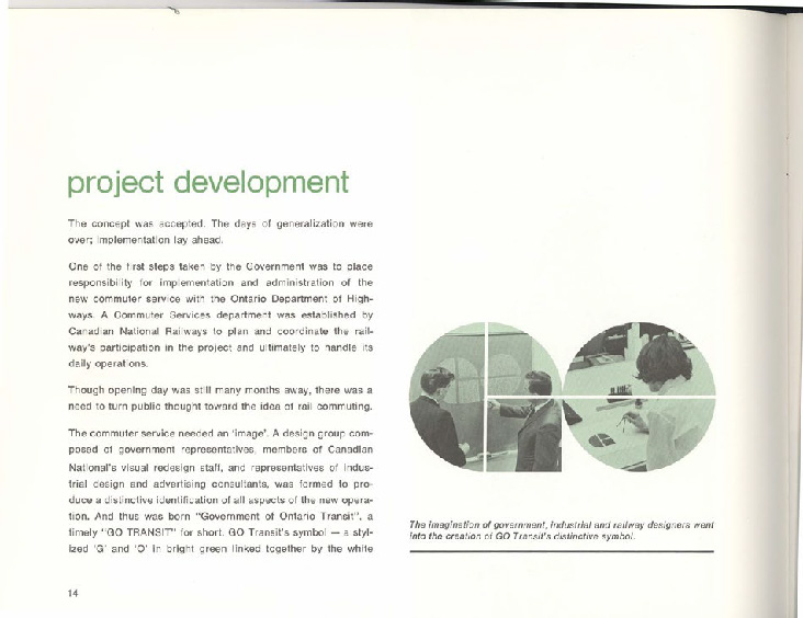
Fox also says that sometimes a design becomes a happy accident. “We had this feeling among us that this couldn’t be true. We went off trying many other solutions, but nothing else was good enough. I know we were surprised, this thing happened rather quickly. We played with the proportions a bit, because we did not want the overlying “T” to disappear, when the logo would be reduced in size.”
Fox admits “A lot of the work in the office was done in a collaborative way. This meant that ideas and concepts were developed in an atmosphere of team spirit. The GO symbol evolved very much in that manner.” Jean Morin was also one of the designers working at the Gangon/Valkus office and as Fox states, was “a ‘key person’ during the design process and should also be given credit.”
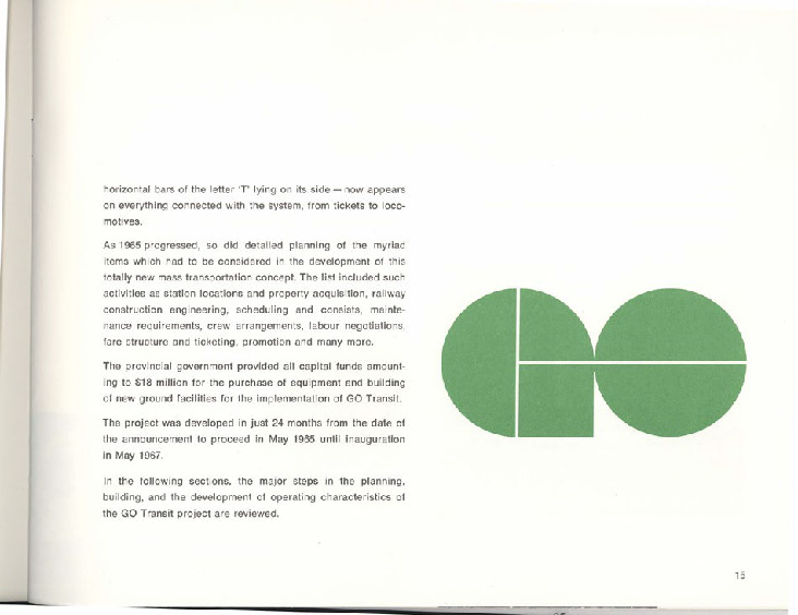
The GO Transit logo is essentially unchanged from the original release in 1967 with the exception of it going under one minor revision a few months after its release. The original design had the ‘G’ and the ‘O’ slightly touching. Today, a gap between both letters, and a white ‘T’ distinguishes the letters prominently. The change may have been subtle but it made a big impact and has stayed true to this day—a true testament to its timelessness.
Soon after the final draft was finished, Fox states, “We made a presentation to McConnell Eastman in Toronto of the original concept, showing the GO symbol and it’s potential application. The development of the concept, etc. was a collaborative effort by members of the Gagnon/Valkus office. After that presentation and an okay from the client, McConnell Eastman took over from Gagnon/Valkus and our role diminished.”
However, not everyone agrees that the GO Transit logo is a true masterpiece. Massimo Vignelli, famous Italian- American modernist designer and creator of brands like Knoll, JCPenny, and American Airlines, feels the GO Transit logo is too ‘playful’ for a government transportation system.
Massimo confidently states that there are less ‘gimmicky alternatives.’ “I think, that it could have been more dignified. For example a plain Futura Heavy or similar typeface, could have been more appropriate for the task. In the GO Transit logo, the letters ‘GO’ are too toy like and the resulting sideway ‘T,’ is not serious. I like the idea of the two discs, as formed by the letter G and O, but it could have been achieved without contriving the letters. A transit system should convey the feeling of reliability, which is just the opposite of playfulness. I find the logo rather ephemeral as style therefore not timeless.”
Massimo continues to say that, “Timelessness requires a certain amount of dignity and strength, virtues completely missed by the GO Transit logo. Pretty, yes, appropriate, no.” For him, appropriateness should be at the core of any solution, otherwise the problem has not been solved. “Prettiness is not enough,” he adds.
Regardless, the GO Transit logo has become significantly woven into the cityscape of Toronto and is an prominent identifier of the transit system that 50 million people ride each year. It’s unmistakably one of the most iconic brands in Canada and has certainly achieved an enviable goal that most designers only dream to accomplish.
If Massimo feels that timelessness requires a certain amount of dignity and strength, why has GO Transit lasted for of so long? In July of 2013, GO Transit announced a slight adjustment to its colour hue, the first revision in 47 years. But with no other changes in sight, one must wonder if a signifiant change, like the one Massimo suggests, could ever be made to it? How would the City of Toronto react to a such a distinct change? And would it break the confidence in the riders, or help it?
Some feel that GO Transit should be applauded for trusting the work of Frank Fox—they didn’t change the design for the sake of change like other brands have done or add any meaningless shimmer to make it look 3-dimensional. What would Paul Rand say if he could see the current abc or UPS logo as they are today?
Fox, who has been modest about his own work, hasn’t asked to be recognized for it. The GO Transit logo, which can be seen on every train, bus, and GO advertisement in the GTA, proudly speaks for it self. Fox may never admit it, but I bet he knew all along the GO Transit logo would still be in use almost 50 years later because he designed it with the intention to function not with the concern of aesthetics.
Besides, isn’t that the real definition of design?
Originally published in GDC Journal #7, 2018
Greg Cunneyworth
Greg is Creative Director and Co-founder of We Make Nice Websites, a digital design agency located in Rochester, NY. He graduated from the Rochester Institute of Technology in 2009 with a Bachelor of Art in Graphic Design.
—
Looking to contribute to the national conversation and elevate the Canadian design communications profession? Submit your article to our editorial team: designcurrency@descan.ca