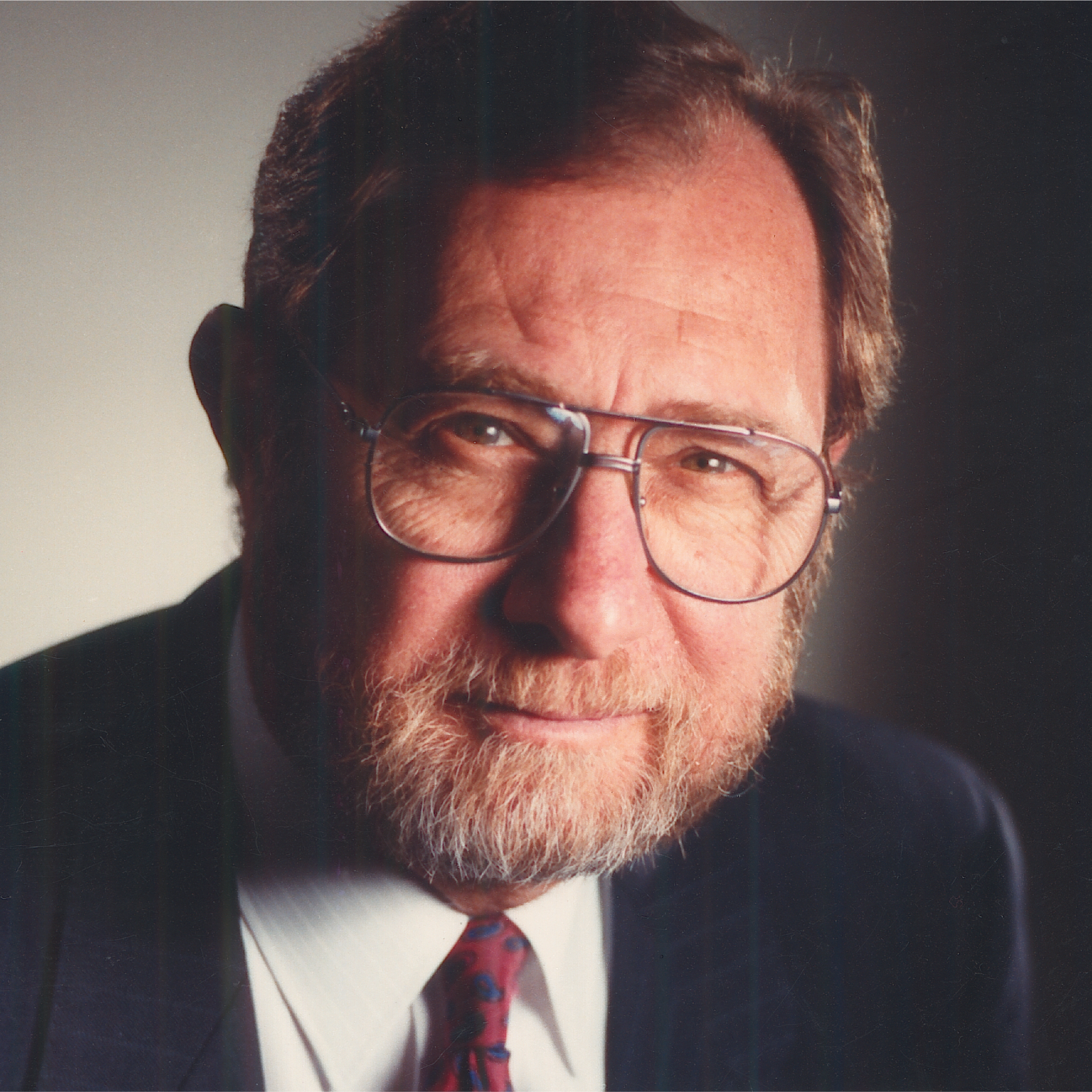

Chris Yaneff made his mark… made many famous marks in fact.
A Torontonian, he followed THE PATH: Ontario College of Art; studied advertising and marketing at the University of Toronto; became Art Director of The Financial Post in 1949, and in 1956, he founded Chris Yaneff Limited: Design Counsel. His company then evolved to include public relations and advertising, with Fred Gotthans as his Creative Director. Professionally, he became a member of the Society of Typographic Designers of Canada (TDC) in 1957 shortly after its inception. He would become GDC Ontario President in 1982 and was made a Fellow of the GDC in 1983. He would later become a member of the Association of Registered Graphic Designers of Ontario (R.G.D.).
Chris Yaneff lived several parallel lives… He was very aware of his surroundings. His business was run from a converted 1890s coach-house in Toronto’s downtown Cabbagetown area. He chose to “live and work in a traditional environment surrounded by antiques, traditional and modern paintings and sculpture.” His interest in fine arts led him to becoming a member of the Royal Canadian Academy (RCA). His hobby — his passion — was flying his Red Biplane with his friend John Waldie. He became a member of the Great War Flying Museum at Brampton Airport.
Chris Yaneff won numerous awards for trademarks and packaging, creating “corporate symbol designs as tools for visual communication to capture public imagination and response.” His designs sum up his philosophy of “unique harmony based on intensive research to create a unique, yet simple, strong statement…”
The Yaneff corporate logo capital “Y” illustrates that approach. It seems so contemporary it could have been created today — the bold simple geometry gains its originality and memorability from its distinctive heraldic slash on the left. The Yaneff symbol is easy to reproduce in all media and sizes. It is a beginning, not an ending—pointing upwards.
His Happy Clown symbol for Conklin Shows greets you and appeals to all ages. The clown eyes are a plus — and work well.
His twirling maple-leaf symbol for the annual Canadian National Exhibition is part of Toronto’s contemporary design heritage; unforgettable, unforgotten, welcomed back every year — standing out among the crowds all competing for attention, seeking to entertain or to be entertained.
Chris Yaneff was able to see “more is less” better than most of us. How do make a capital “T” original yet maintain its simplicity? You reverse it as a white letterform and surround it with a solid background block — and you have created a capital C from one angle, a capital T from the other — combined, you provide a distinctive, versatile identity for Canada Trust, helping it stand out from its many competitors. For one of those competitors, Financial Trust, you blend a dominant capital F with a lower but wider capital T: the letters combine three-dimensionally into a memorable flowing form. You have achieved identity and uniqueness and style.
Chris Yaneff’s work has been featured around the world, as examples of fine Canadian Design, in most of the leading design publications such as Graphis, CA, Modern Publicity, etc. and of course in leading Canadian design exhibitions such as Typo Mundus (1960s) and their precious catalogues which, over the years, continue to inspire tomorrow’s graphic designers in Canada and elsewhere as they follow in their clearly marked footsteps of Chris Yaneff — a great designer who loved to fly higher to see our world from a unique angle.
Born in 1928, Chris Yaneff passed away on April 30, 2004 at age 76.