
Jim Rimmer was born on April Fool’s Day, 1934 in Vancouver BC. His education was scant, his career in Graphic Design and letterpress printing based only on the naivete that all one needed to do was to love to draw. He attended Vancouver Technical School, which gave an introduction to metal type and presses through the school’s large printing trade shop. He began his apprenticeship as a compositor and (although he had no hint at the time) typefounder. After six years of apprenticeship he moved on to work on various daily and weekly newspapers.
His first taste of working in “art” came about while he was a Linotype and Monotype operator/floor compositor at the Williams Lake Tribune. On several occasions it seemed to him a good idea to present a print client’s letterhead as a gouache and brush layout, rather than going straight to the type case. When it was discovered that the kid could draw a little, the publisher asked him if he could knock out a cartoon once a week. He did this for the sum of five dollars for each. The money was beginning to roll in.
When it looked like he had reached the cash ceiling, he and his wife and family of three returned home to Vancouver, where after two more comp room positions he decided to try in earnest to break away from the rapidly shrinking letterpress trade he attended two semesters of evening classes in graphic design at the Vancouver School of Art, under the instruction by designer and illustrator Graham Booth. His first interview for a design position landed him his first real job in the field at The Columbian Newspaper/ Craftsmen Press in New Westminster. He remained in this position for seven years, and in 1969 moved on to work at Brock Weber Printing, then on to Tri Graphic Studios and then Creative House. In 1973 he rented a spot in Gastown and began a freelance career that would last 32 years, until his retirement in 1999. In the last four years of his working life he was Type Director of Giampa Textware/Lanston Type Co, who were busily digitizing revival faces from the holding of letter patterns from The Lanston Monotype Machine CO.
During his freelance years he worked on projects for the major agencies and design studios in Vancouver, for corporations, airlines, mining and forestry companies. A large part of his work entailed letter design and lettering projects.
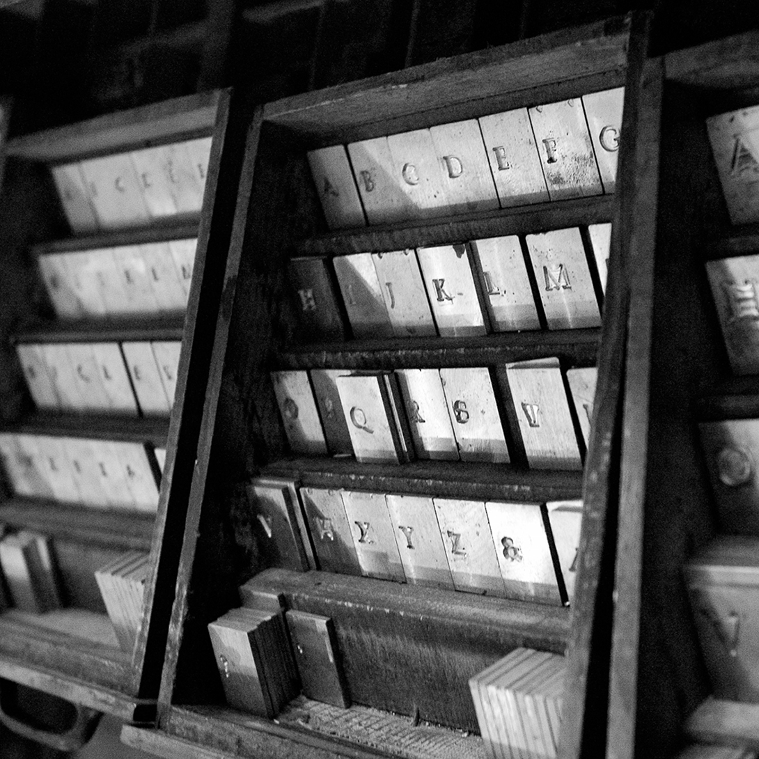
He designed and cut in metal his first typeface, named Juliana Oldstyle in 1981, and because he had in his hands the matrices for this face, found it necessary to acquire more type casting machines. Some years later he located three pantographic engraving machines, and more casters. Since they needed to be kept working, he design and cut more faces in metal: Nephi Madiaeval; Albertan; Fellowship; Duensing Titling in seven sizes; Canadian Syllabics (Cree); Quill; and Carl Dair’s Cartier. One of his latest designs is 18 point Hannibal Oldstyle, made to run on the Monotype Composition Caster, and for his printing of The Adventures of Tom Sawyer.
Since retirement he has hand set and printed four books: Shadow River, Pauline Johnson; A Christmas Carol, Charles Dickens; and his autobiography, Leaves From the Pie Tree. The Adventures of Tom Sawyer is in progress at this writing.
Because of his growing reputation in typography he was invited to teach, and did so off and on on a contract basis for Capilano College, ECIAD, Langara College, Kwantlen College, Richmond and UCFV, Abbotsford.
He was always in contact with some original students and a handful who were new to him, and came to look and some to learn. On occasion he conducted workshops in printing, typecutting and book binding at his workshop. Students are from such far-flung places as San Francisco and Chicago
In 1998, he began producing his own digital library of typefaces, many his own design and some revivals. He produced 190 or so individual fonts, which are now marketed by P22 Type Foundry of Buffalo, NY.
Jim was member of The American Tyecasting Fellowship, for whom he had spoken several times. His printing and typefounding workshop was visited by groups from libraries, universities and colleges. He was feted in November of 2006 by Simon Fraser University at an event called “Rimmerfest”. A large collection of his work and papers are lodged in SFU’s Special Collections in The Bennett Library.
In 2009 BC Chapter of the GDC, in partnership with Hemlock Printers announced a Jim Rimmer Scholarship Award. The first recipients are to be acknowledged at Practivism 2010.
The quintessential renaissance man, Jim hacked away at the garden, drew, made new type, printed new books, held cats on his lap, cut letters in marble, played jazz on his coronet, gathered carving wood on the banks from the Fraser River and had started to build a steel string guitar.
Jim passed away following a fierce battle with throat cancer on January 8, 2010. He is survived by his wife Alberta, after whom the font Albertan was named.