Since beginning his career as a lettering artist in the early 1970s, Rod McDonald’s work as a designer, educator, historian and writer has encompassed virtually every aspect of the typographic arts.
Despite his accomplishments as a lettering artist, however, it was twenty years before McDonald tackled his first typeface design.
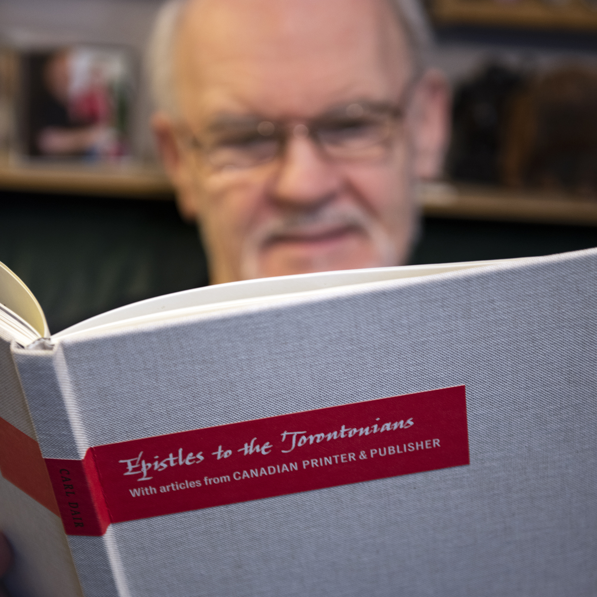
“I felt that my career had plateaued,” McDonald recalls. “I was doing a lot of wordmarks and corporate alphabets, but yearned to do more. I wanted to produce a true text face design.” His first undertaking was a highly detailed and sensitive revival of Carl Dair’s Cartier. Originally released in 1967 to celebrate Canada’s centennial, Cartier was the first Latin typeface to be designed in Canada. McDonald’s digital revival, Cartier Book™, refined Dair’s, sometimes problematic, design and expanded it into a fully functional type family that is both distinctive and remarkably legible.
McDonald began his second typeface family in 2001 when the Canadian news magazine, Maclean’s, invited him to join the design team to ‘renovate’ the then 96-year-old publication. McDonald would be responsible for designing a new masthead and for the overall typography of the magazine, including the design of a new text typeface family. This was the first time in history that a Canadian magazine had commissioned a custom typeface.
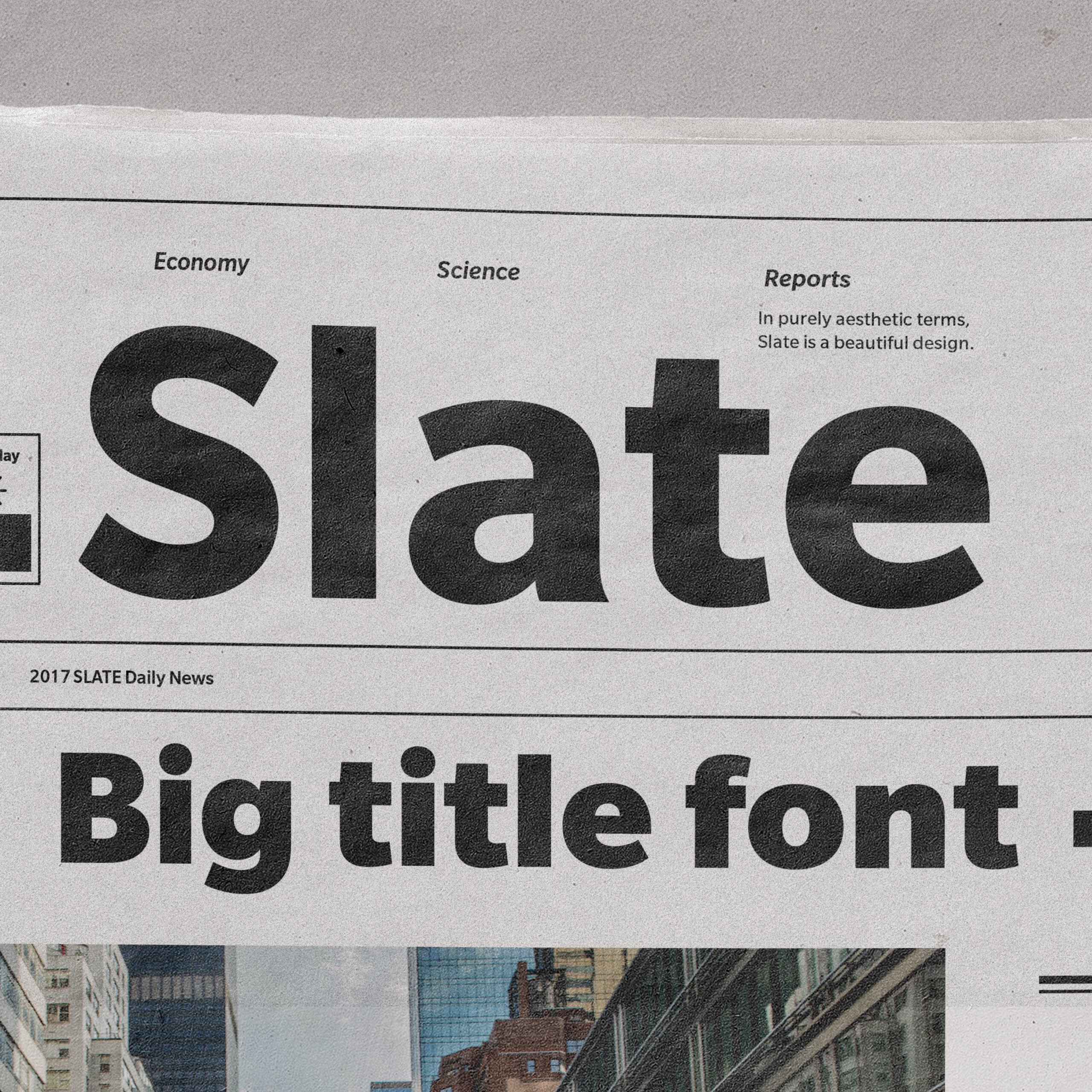
The face, named Laurentian™, was launched in Maclean’s July 1, Canada Day issue. In January of 2003, Laurentian was entered in the New York Type Directors Club Annual Typographic Competition and was one of thirteen designs chosen by the international jury. Laurentian is now part of the Monotype typeface library. In 2011 his Egyptian Slate™ family was one of 50 winning entries chosen for inclusion in the ATypI Letter.2 competition in Buenos Aires.
McDonald has worked both as a freelance typographic designer and on the staff of such renowned typesetting companies as Mono Lino Typesetting and Cooper & Beatty in Toronto. His alphabets, wordmarks and symbols have been used by organizations ranging from General Motors and the National Arts Centre in Ottawa to Canadian Business and Chatelaine magazines. He has taught numerous typography courses at the Ontario College of Art & Design in Toronto and NSCAD University in Halifax.
In April 2012 McDonald was made a Fellow of The Society of Graphic Designers of Canada (GDC). He also writes a column on typography for Applied Arts magazine. Launched in September 2023, Rod has led Phase 1 of the Canadian Typography Archives website, drawing on his encyclopedic knowledge of typography, from the first printing press in Halifax in 1752, up until the beginning of the digital era in 1985.